Fonts can have a huge impact on how your writing comes across. Just imagine turning in a college paper in Comic Sans, or making a poster about a children’s birthday party and using a serious Times New Roman font: it doesn’t jibe.
Still, if you’re not tech-savvy or artistic, it can be hard to know, in some situations, what the best fonts are to use. Most of the time, it’s appropriate to go with the pack: whatever other people are using is probably a good bet for you to use, too. But how do you know what’s popular? Enter our list of some of the most popular fonts below.
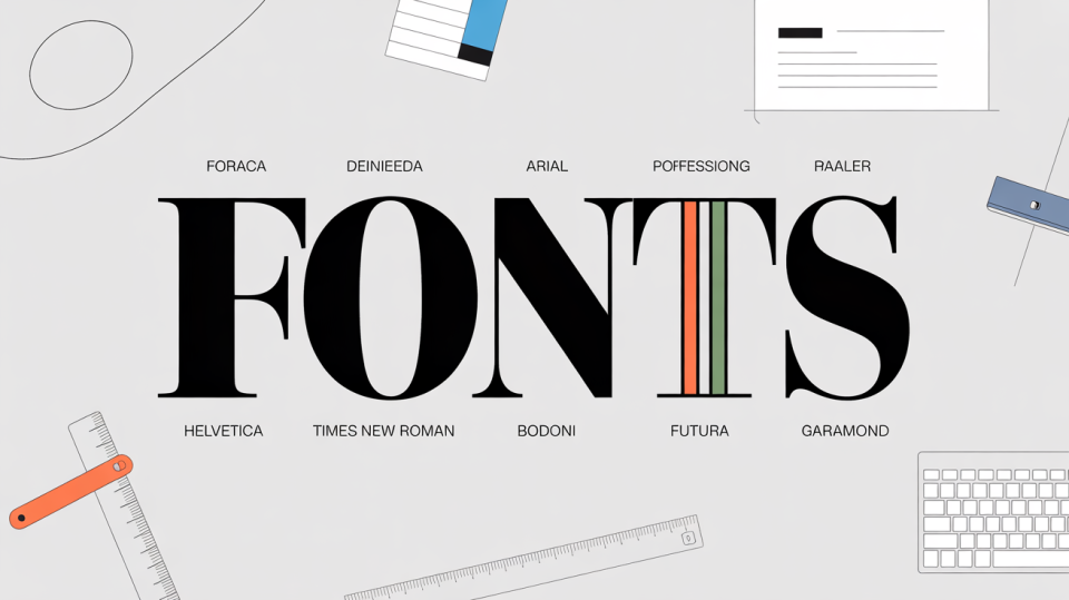
Most Popular Default Fonts
Default fonts are the fonts that pop up in your word-processing app before you pick a specific font. Google Docs, Word, and Pages all have different default fonts.
You had to be expecting to see this one on this list somewhere. One of the most well-known fonts of all time, this sans-serif typeface is the default font for Apple’s word-processing app, Pages. Helvetica is considered to be a very neutral font and is good for work documents and serious announcements, but not necessarily great if you’re trying to get creative or have some fun.
Again, this is a very classic font and is often used in schools for papers. The default typeface for Word, Times New Roman was originally made for a newspaper called — you guessed it — The Times, which is where it got its name.
Finally, if you’re part of the internet revolution that’s using Google Docs all the time, you’re probably familiar with Arial, the digital word processor’s default font. This font is designed to look like Helvetica, which makes it a good choice for files that you want to be readable in any word processing app.
Most Popular Graphic Design Fonts
On the other hand, if you want to create a cool poster or start building out your graphic design skills, you probably don’t want to just go with the boring defaults. Here are a few of the staple fonts many graphic designers use that you can give a try:
A Greek-style font, this serif typeface was first created in the 1980s. It’s great for history projects, museum events, or anything else where you want to evoke an ancient vibe.
If you want to get a bit spicy with your design, you can give Bodoni a try. Designed to look like another font, Baskerville, Bodoni is a serif typeface that offers obvious contrast between the thickness of different strokes as well as a geometric style.
As the name suggests, this font offers a glimpse into the future. With a bold and simplistic design, Futura, created in 1927, is a great pick for any piece, despite its old origins.
Most Popular Fonts for Books
If you’re a fan of reading, you might notice that the fonts in your books aren’t quite the same as the font in your word-processing app. That’s because there are a few fonts that are used specifically for typesetting books. If you want to make your own home-printed manuscript feel more professional, here are a couple of fonts you could use:
This font is hundreds of years old, with very historical vibes. But that makes Baskerville all the more suited for books, especially historical fiction and serious literary endeavors.
This serif typeface was also created hundreds of years ago. Its modern form doesn’t look quite like its first iteration, but still, Garamond has a classic, easily-readable style that’s suitable for a range of different books and audiences.
Accessibility in Fonts
Something many of us are lucky to not have to think about is accessibility and readability in design. Though fun, kooky designs may be cool to you, keep in mind that they can be difficult for others to read, for a range of reasons — be it dyslexia, vision impairments, or other disabilities. When you’re making a design for a wide audience, make sure your font is something that you can read with a screen reader.
That means, for the most part, the strange new fonts you find on DaFont.com are probably out. On the other hand, some of those more classic, default fonts — like Calibri, Helvetica, Arial, and Times New Roman — are all great choices. And don’t forget: bigger is better wherever possible!
Our Font Tools
Want to create your own cool font? Check out our Cursive Font Generator and our Friends Font Generator.