
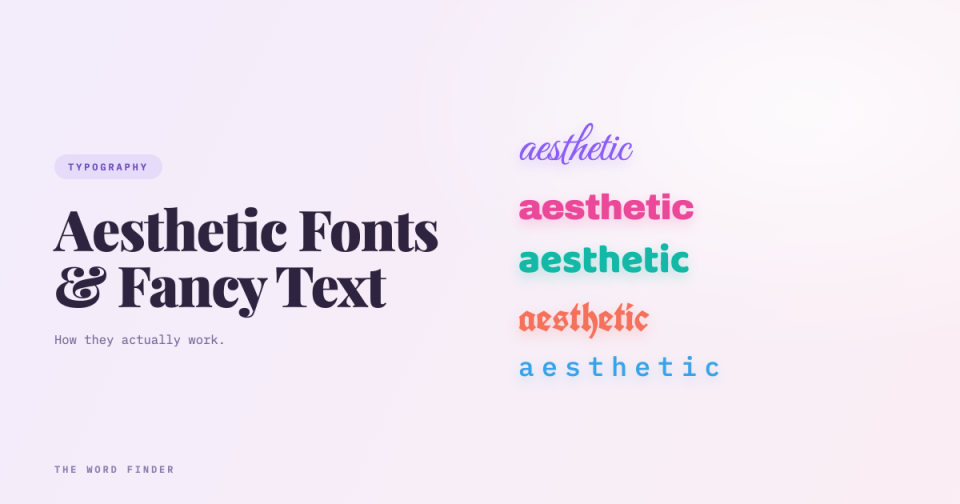
Here is the thing nobody mentions in the “aesthetic fonts” posts: they are not fonts.
That sounds like a technicality. It is actually the explanation for everything else about them, including why they survive a copy-paste into your Instagram bio when bold text does not, and why a screen reader cannot make sense of them.
They are characters, not fonts
The Unicode Consortium is blunt about this in its own FAQ: “The Unicode Standard is not a software program, nor is it a font. It is a character encoding system, like ASCII.”
So when you paste 𝗕 into your bio, you have not applied bold to the letter B. You have used a completely different character. Its actual name is MATHEMATICAL SANS-SERIF BOLD CAPITAL B, and to a computer it is as distinct from a normal B as ß or Я is. It only looks like a bold B to you.
Most of these characters come from a Unicode block called Mathematical Alphanumeric Symbols, which holds the bold, italic, script, gothic, double-struck and monospace variants that fancy text generators serve up. The block exists so that mathematicians can write a bold vector v and a plain scalar v in the same equation and have them mean different things. Every fancy text generator on the internet is quietly strip-mining a maths notation system.
Which explains the copy-paste trick
Normal bold is formatting. It lives in markup wrapped around your text, and when you paste into a plain-text field like a bio, the field takes the letters and throws the formatting away. That is why you cannot bold your Instagram bio the normal way.
Fancy text has no formatting to throw away. The appearance is baked into the character identity itself. There is nothing to strip, so it survives.
And that is the trade in one sentence. Fancy text survives copy-paste for exactly the same reason it breaks everything else: the machine genuinely believes you typed different letters.
The vaporwave one is a 1980s accident
The wide text look comes from a Unicode block called Halfwidth and Fullwidth Forms, and it exists for a reason that has nothing to do with aesthetics. Early Chinese, Japanese and Korean computer systems laid characters out on a fixed-width grid, and Latin letters needed a full-width version to line up on it. The block was added to Unicode so those older encodings could be converted without losing anything.
So the vaporwave aesthetic is a Japanese word-processing compatibility artefact from the 1980s, repurposed thirty years later as a mood.
What Unicode and the W3C actually say about using them
Both have said, in writing, don’t.
Unicode’s technical report on mathematics states that the characters in this block “are intended for use only in mathematical or technical notation; they are not intended for use in non-technical text.”
The W3C goes further, in a formal web standard. MathML 3.0 says Mathematical Alphanumeric Symbols “should not be used for styled prose,” because doing so “would create problems for searching, restyling (e.g. for accessibility), and many other kinds of processing.”
That is a web standard, using must not, naming search and accessibility as the casualties, back in 2014.
The accessibility cost
This is the part that matters most and gets written about least.
Scope, the disability charity, published a guide on this written by Holly Tuke, who is blind and uses a screen reader daily. Her explanation is exact: “While a sighted user can see a stylised ‘t’, a screen reader may read out ‘mathematical sans-serif script t’. This means that even a short word can take a long time for screen reader users to process.”
Think about what that means for a five-letter word in cursive. There is no styled t for the software to announce, so it announces the character’s name instead. Your pretty bio becomes a recital of character names.
The honest nuance, which Scope makes and most posts skip, is that the behaviour is not uniform. Some screen readers read most special characters, some skip them entirely, and it depends on the reader and on the user’s verbosity settings. Scope’s conclusion is the fair one: “you can’t guarantee your message will make sense if you’re relying on special characters alone.”
And it reaches wider than screen readers. Scope notes the same characters are harder for people with dyslexia, people with low vision, people reading in a second language, and honestly for everyone, because they add visual noise your brain has to work through.
The practical costs, too
Beyond accessibility, treating characters as decoration breaks things:
Search stops working. To a machine, 𝕗𝕠𝕟𝕥 and font share no characters at all, so nobody searching the plain word finds your bio. That is precisely the “problems for searching” the W3C named.
Rendering is unreliable. These characters live outside the basic range that devices support best, so on a phone whose fonts lack coverage, your carefully styled bio renders as a row of empty boxes.
And the small stuff bites: @-mentions, autocomplete, and alphabetical sorting all stop matching your name.
I should be straight about one thing: I found no platform documentation showing a ranking penalty for fancy text, and you should ignore anyone who claims otherwise. The problem is not a penalty. It is that machines cannot read it.
How to use them without the downside
None of this makes fancy text useless. It makes it a garnish rather than a meal.
Keep your name, your handle, and anything a person needs to act on in plain characters. Use the styled version for a short decorative flourish, a divider, a single word you want to pop. Never put your whole bio in it, and never put the important sentence in it.
If that is the job, our Cursive Text Generator will give you the flowing script for a line of your bio in a second, and the rest of our text generators cover the other styles. Use them for the flourish. Leave the message readable.
Frequently asked questions
What are aesthetic fonts?
They are not fonts. They are separate Unicode characters shaped to look like styled letters, mostly drawn from a block intended for mathematical notation. A “bold” letter in a bio is a different character from the normal letter, not the same letter with bold applied.
Why do fancy fonts work in Instagram bios when bold does not?
Bold is formatting, which lives outside the text and gets stripped when you paste into a plain-text field. Fancy text carries its appearance inside the character itself, so there is nothing to strip and it survives the paste.
Can screen readers read fancy text?
Often not usefully. A screen reader may announce the character’s name, such as “mathematical sans-serif script t,” rather than the letter, which makes even a short word slow and confusing. Behaviour varies between screen readers and settings, so you cannot rely on your message getting through.
Do aesthetic fonts hurt your SEO or reach?
There is no evidence of a ranking penalty, so be sceptical of anyone claiming one. The real problem is that machines see different characters entirely, so your text is not matched by searches for the plain word. The W3C flagged exactly this problem in a web standard.
Should I use aesthetic fonts at all?
Use them sparingly. Keep your name, handle, and any key information in plain characters, and save the styled text for a short decorative touch. That way you get the look without making your bio unreadable to a chunk of your audience.
Why does the wide vaporwave text exist?
It comes from Unicode’s Halfwidth and Fullwidth Forms block, which was created so that Latin letters could line up on the fixed-width grids used by early Chinese, Japanese and Korean computer systems. The aesthetic is a repurposed compatibility feature.
